Last year I saw a lot of powerful visualizations that used Google Data Studio, from business dashboards to data stories using publicly available data. So I thought I would feature some of them (including two of my own 🙂 to help you get inspired for 2018.
Below I showcase a few visualizations for both business contexts and general data stories (in the spirit of data journalism). While data visualization can come in different tastes and scents, I chose the examples below based on some industry best practices: good choice of charts for each data type, great design (both colors and formatting), and interesting storytelling.
Business Visualizations
The visualizations below are interesting examples of how companies are using Data Studio to make business reporting more effective and powerful.
Boat International Media: SEO Performance

Using Data Studio, Boat International Media simplified their monthly client reporting process from five days to fifteen minutes. They take design very seriously, and put a lot of effort into building a report that focuses on clear key insights, avoids clutter, and looks good enough to send to clients as a PDF as well as viewing online (by Fanni Takacs and Drew Broomhall).
Google Analytics Web Activity Overview: Data Studio template
This dashboard template, created by the ClickInsight team, is a great place to start visualizing Google Analytics data. Learn more about how to customize it for your own company in this blog post.
Analytics Overview: Data Studio report
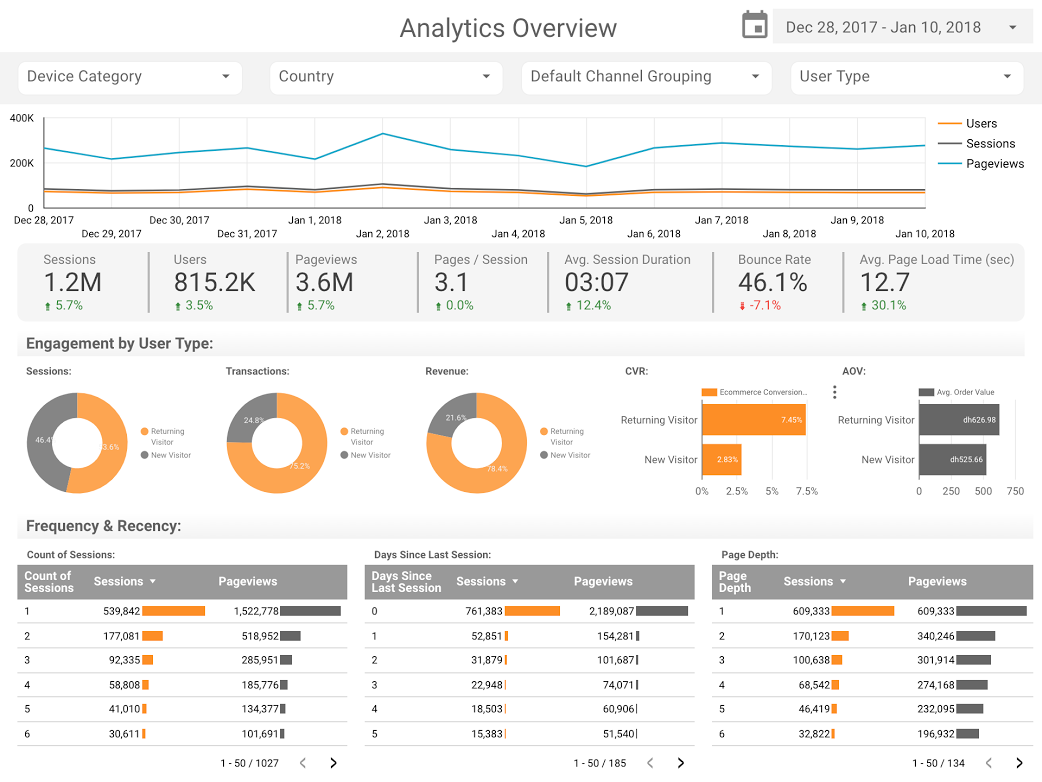
This dashboard takes advantage of several features to provide a compact, clear, and interactive presentation for Google Analytics data, one of many readily accessible data connections within Data Studio. Designed by Sunil Attri, Senior Consultant at E-Nor.
Page Level Engagement using Bullet Charts
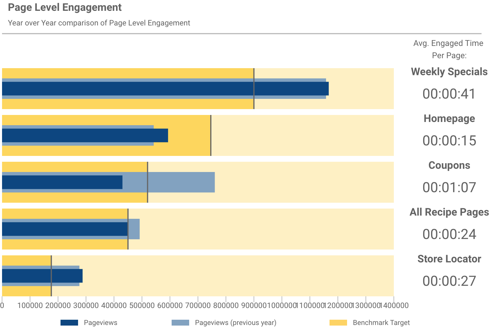
By combining bullet charts, the team at Analytics Pros are able to see how pages are performing compared to both last years numbers, as well as the benchmark targets for each. From there, the team add scorecard metrics to understand not just how many times users are visiting the page, but how long they stay engaged.
Journalistic Stories
The visualizations below showcase interesting examples of how individuals use Data Studio to tell data stories about fun and interesting subjects on movies, technology and the world around us.
Marvel vs. DC Cinematic Universes
A lot of people enjoy watching a good superhero movie on the cinema, so much that they spent $27B in the box offices worldwide! Above is a visualization comparing the success of Marvel vs. DC in the war to conquer the hearts of their audiences, created by me (read more).
The data behind Star Wars
And naturally, we can’t talk about the big screen without mentioning Star Wars! The team at ClickInsight has recently released an insightful report showing some of data behind this epic story. Finally, we can compare world differences, starship speed, and character details (click on tabs below to browse through the report).
Who contributed the most to open source in 2017?
The open source world is incredibly important for the web to be as awesome as it is, and a lot of individuals and companies contribute to it. Google’s Developer Advocate Felipe Hoffa took the time to pull all the PushEvents published by GitHub during 2017 and built a visualization to show some interesting findings – he did that by importing the data into BigQuery and using the BigQuery connector. You can check the dataviz above and read more about it in his post.
150 Years of Marriages and Divorces in the UK
There is a lot of talk about marriage and divorce trends, but what exactly does the data say about that? In the visualization below, myself and Lizzie Silvey present the results of an in-depth analysis of UK marriage and divorce trends. They answer the following questions: Who wants a divorce and why? How do wars and the law impact marriage and divorce rates in the UK? Read more in this article.
Build you own dashboard!
As you can see, there are multiple ways for you to analyze and communicate data using Google Data Studio, and it is really fun!
Give it a try at https://datastudio.google.com and happy visualizing!

